Programs Used: Adobe Illustrator, Adobe InDesign, Adobe Photoshop, Cinema 4D, and Figma
This project was about choosing a non-profit and revamping its brand identity.
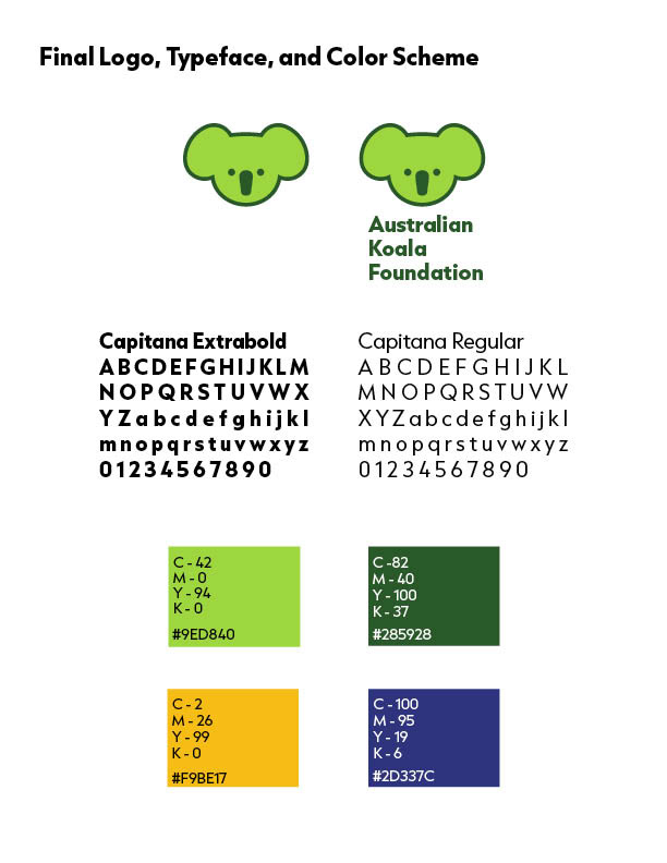
In choosing the final color scheme I wanted to do something related to nature because the non-profit is about trying to save koalas from going extinct through saving or planting eucalyptus trees and raising funds to give koalas the care they need to survive. Going with green accomplished this and was an improvement from the John Deere looking colors. The yellow gets used to bring contrast when using photographs since a lot of photographs of koalas have a lot of green in them. Blue is used with the website to have similarities to the original website. With the typeface, I chose it based on how I thought it looked with the logo. Since the logo itself is very rounded I wanted to make sure I chose a typeface that was very round and circular.

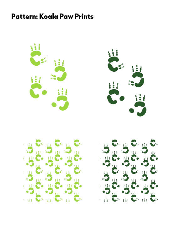
For the pattern I wanted to create something that was intriguing but it was hard because not a lot of things I could think of with koalas were specifically only for koalas. I then came up with the idea of doing paw prints because the Australian Koala Foundation deals with wildlife and koalas have a very unique paw print.

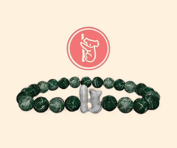
This is the first new application I did. Fahlo is a company that works with non-profits that specialize in raising money for specific animals and I thought it would be a good fit to at koalas since they are an endangered species. They have both tracking bracelets and plushies, but I wanted to do the bracelet. I did all the modeling for the bracelet in Cinema 4D and all of the illustrations and vectors in Adobe Illustrator.
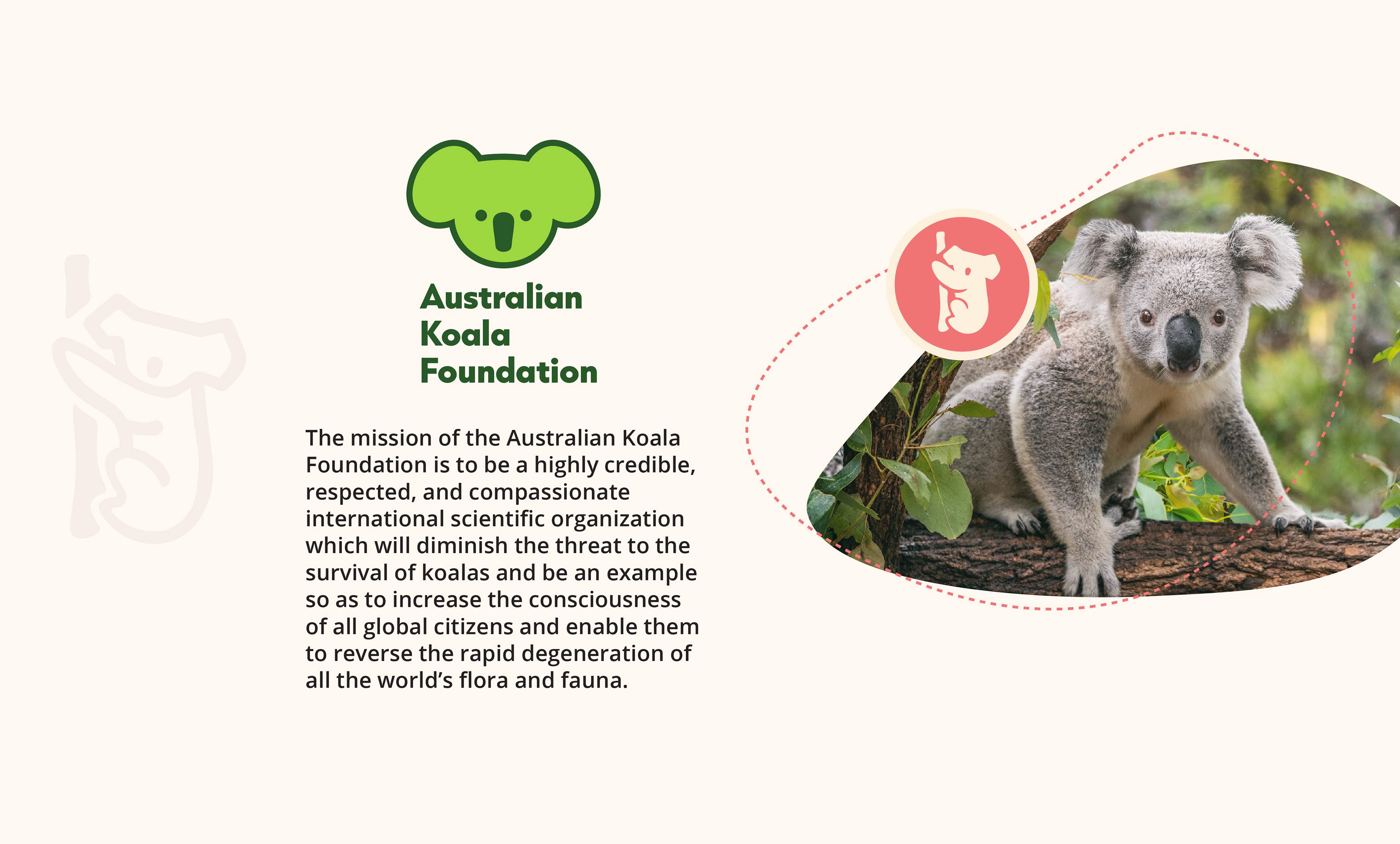
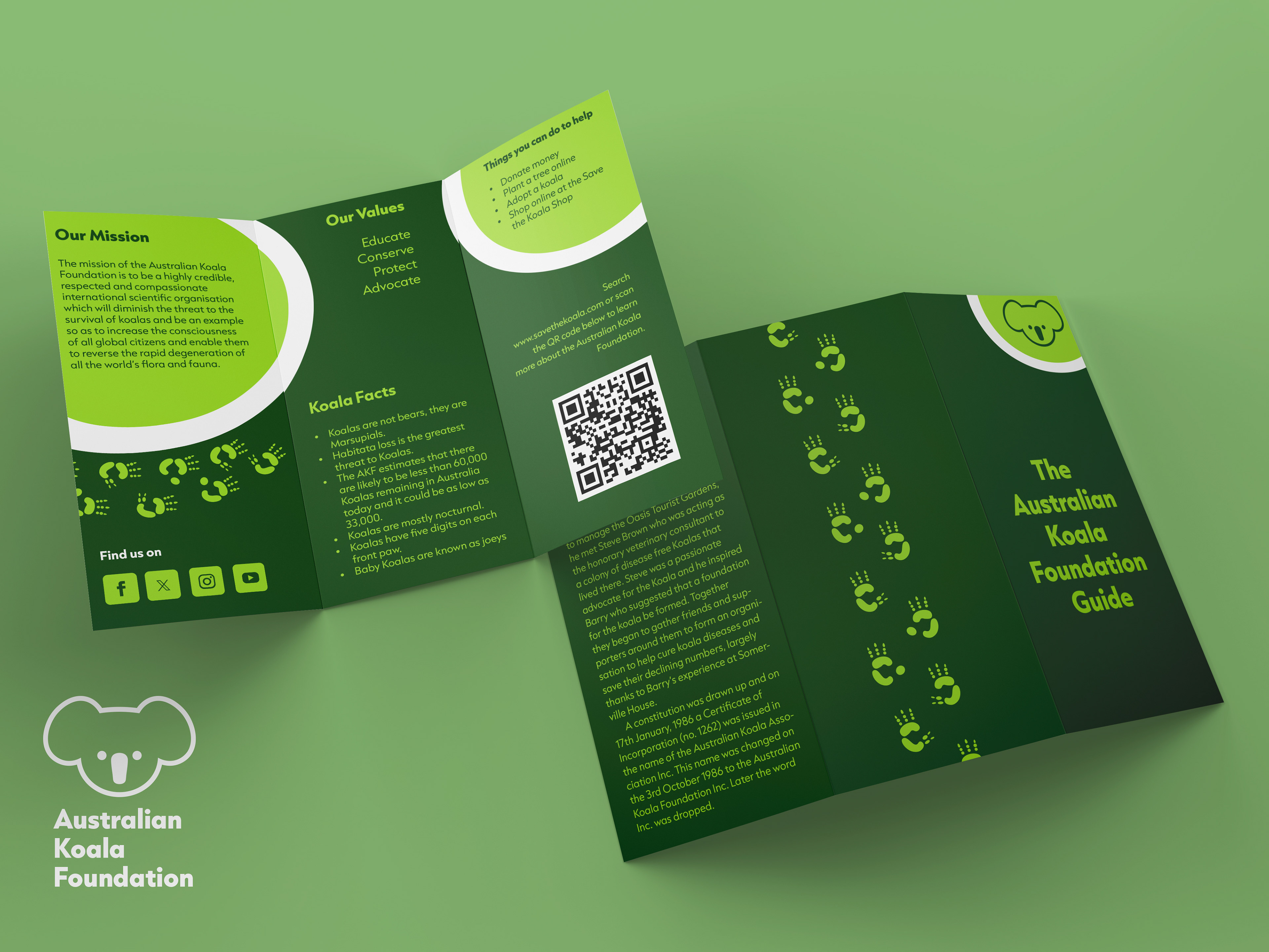
The second application I did is a brochure that lists the Australian Koala Foundation's mission and values along with their story and how people can help their cause.
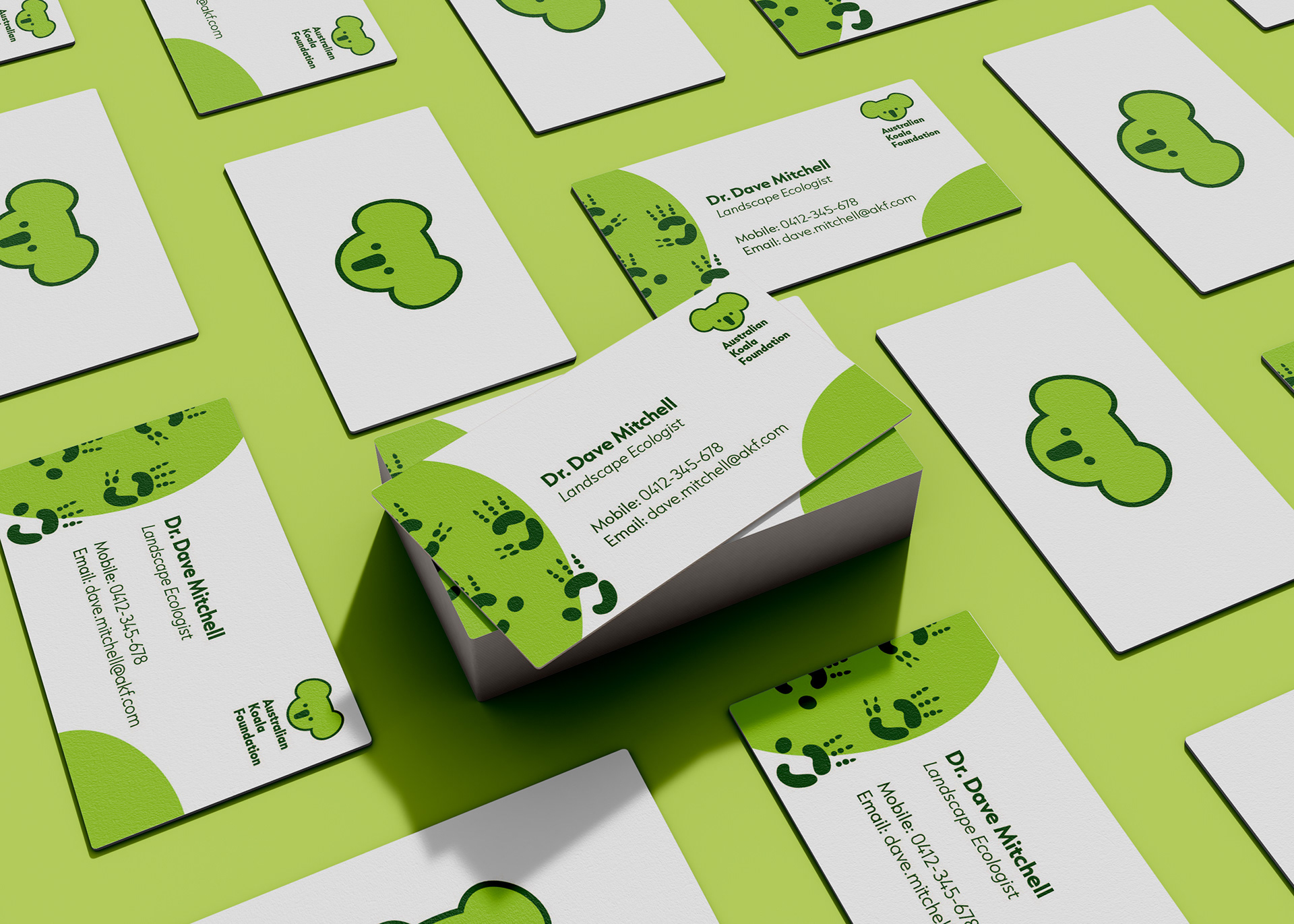
The third application I did was a business card for any of the employees that work for the Australian Koala Foundation. On the front it has their name, job title, phone number, and email. On the back is their new updated logo.
The fourth application I did was updating the website and the iconography they had. Originally it had a lot of generic imagery, but I created some vector drawings to keep the cohesiveness throughout the brand. These drawings also include aspects of the logo in them.

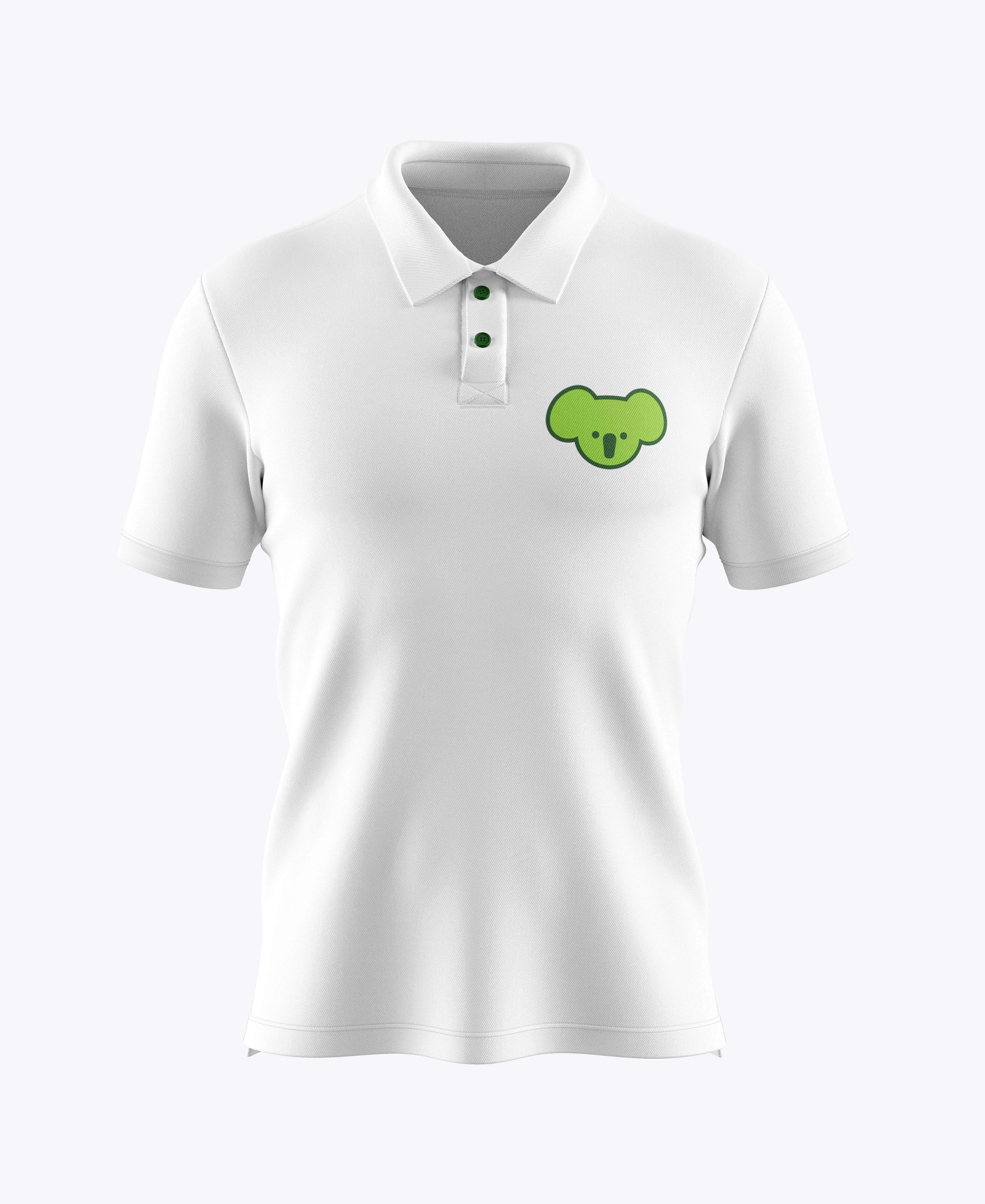
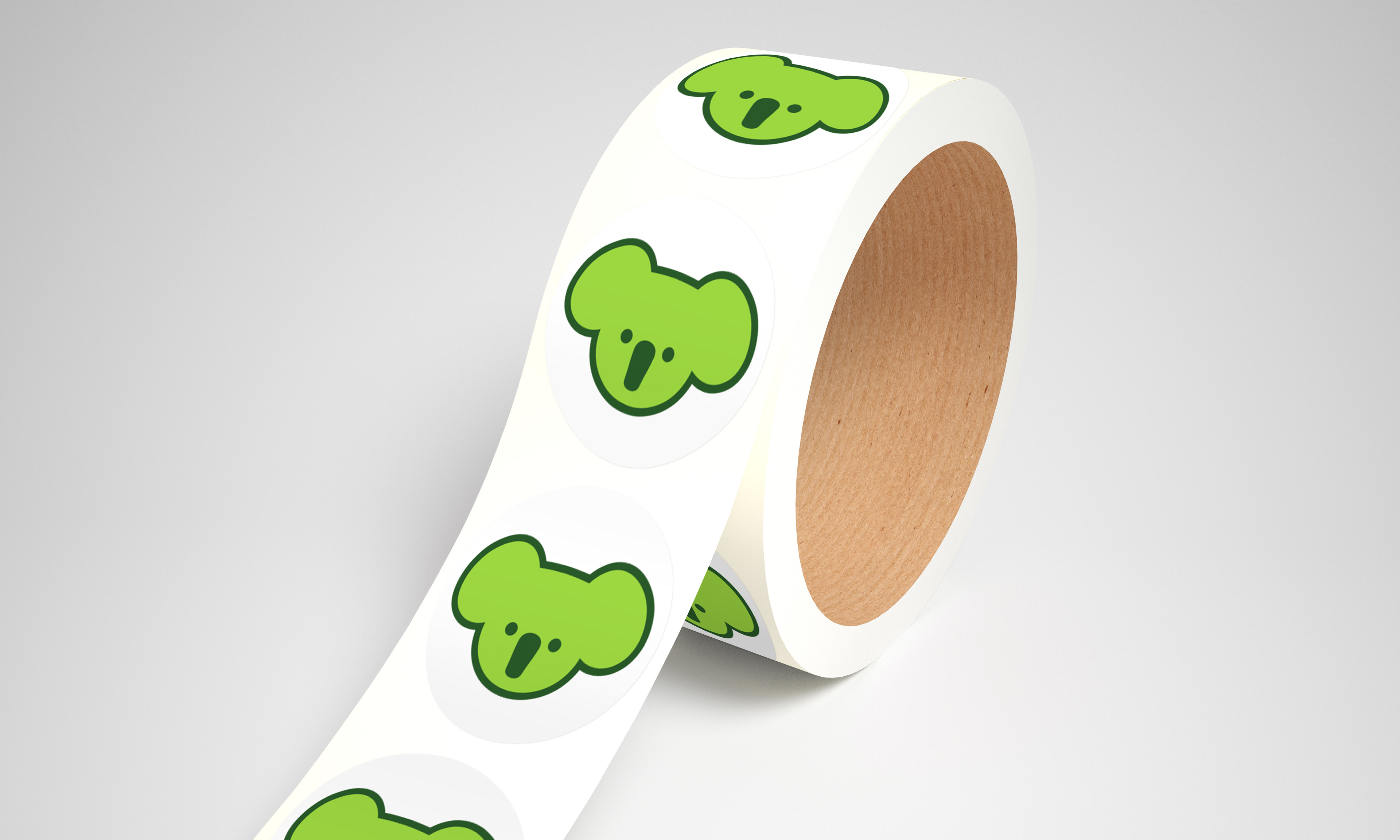
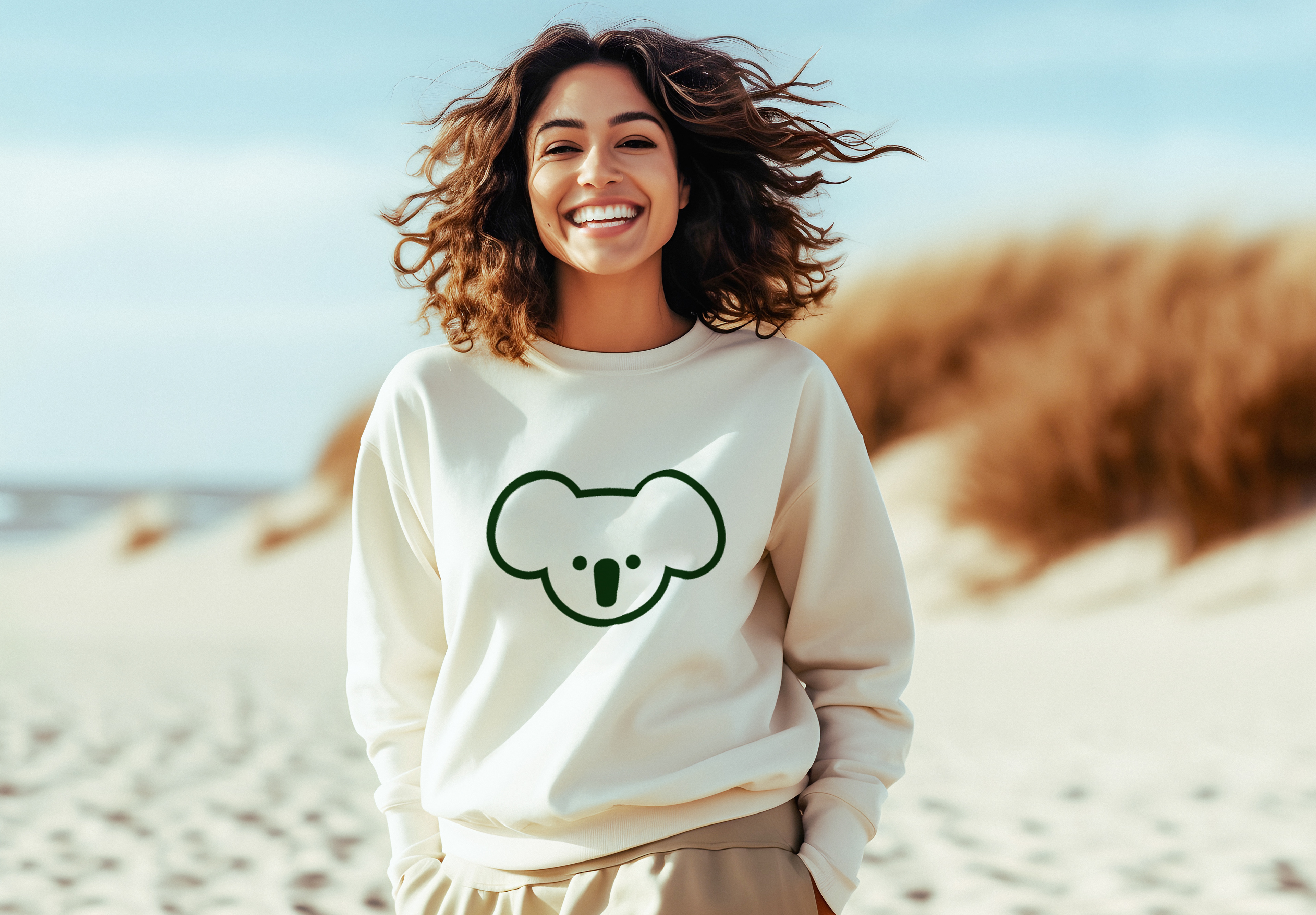
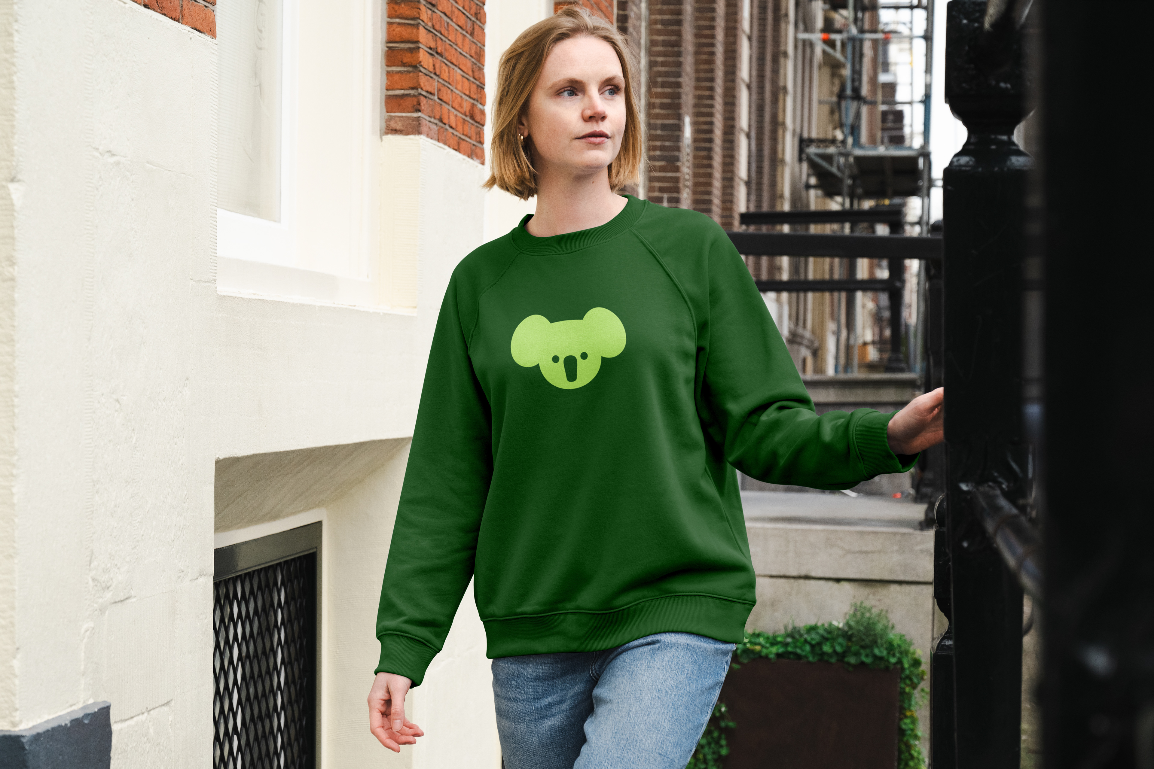
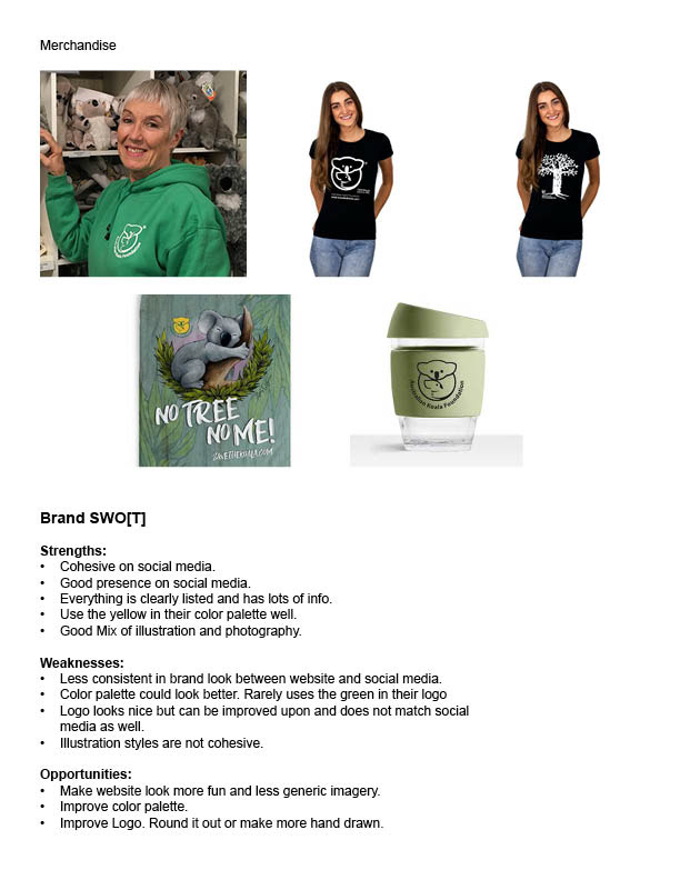
The fifth application I chose to do was merchandise because any merchandise on their website that went with branding was a black t-shirt with their logo on it. With these I added a polo someone could wear to work, some stickers they can give out at fundraisers and events, two sweatshirts people can wear, and a t-shirt they can give out at events.

Process
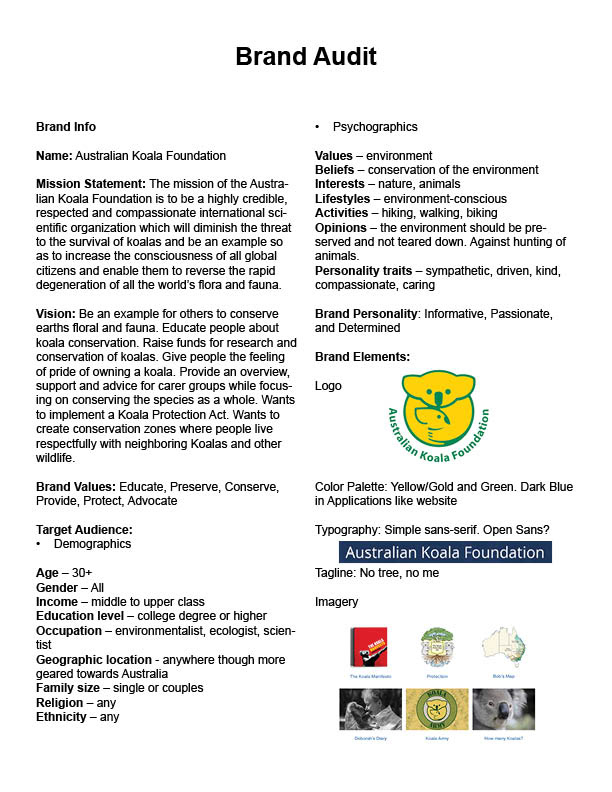
Brand Audit
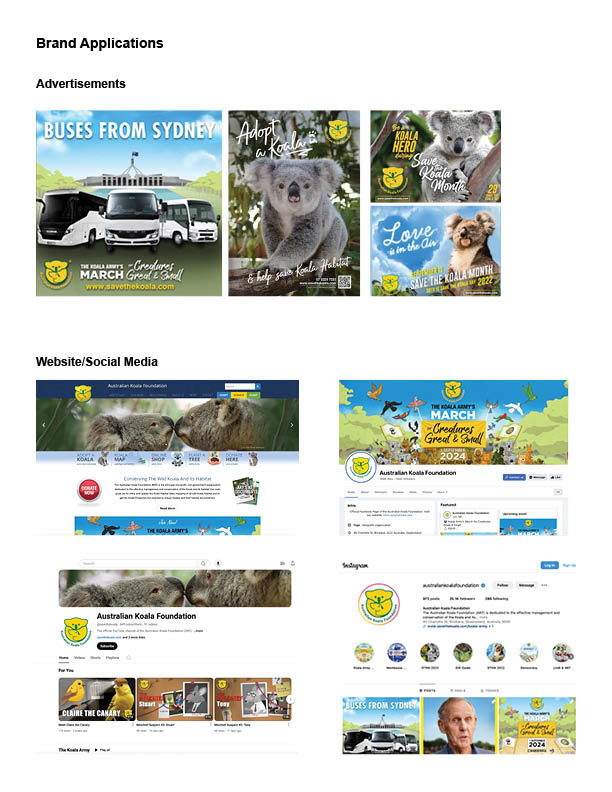
The first step was to create a brand audit of the non-profit to find out its strengths, weaknesses, and opportunities for improvement. I also gathered examples of their current applications of their brand.
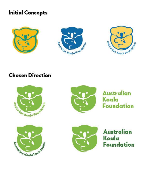
Next came the initial three concepts. The purpose of this project was to revamp the brand identity and not completely change it so I had to use the existing logo and enhance it in a way that still fit with the company. The first was more organic and focused on the nature aspect related to the non-profit. The second was taking their existing logo and taking out the outline. The third was keeping the logo as it is but adding some more rounded edges.
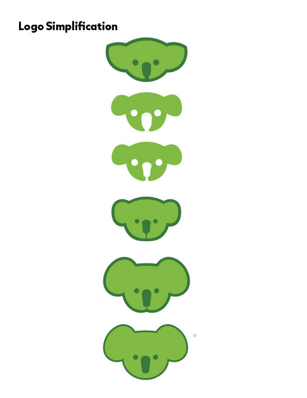
With the chosen direction, I began experimenting with how I could simplify the logo so that when scaled down it would still be very readable especially with the favicon. With this idea, I decided to use only the koala's head instead of the full body and the baby koala's head. In the simplification process I began making it more rounded and look a lot more like a koalas face while still having a geometric feel to it.